I’m extremely proud that Graphic Zen was chosen to create the new brand identity for the Meridian Chamber of Commerce. The project was very rewarding to work on, as I live and work in the Meridian community, and love my city. After initial concepts were created about 4 months ago, and in conjunction with direction from the logo selection committee, the final design is presented below:
The Chamber wanted to incorporate bold, dynamic colors, to reflect the change in the organization, and the “M” shape reflects the diversity and agility of the new Chamber. Additionally, the “ID” in Meridian is highlighted to identify the Chamber’s location in Meridian, Idaho, as opposed to the other Meridian cities in the United States.
The cityscape below the name was designed to honor the Chamber’s past, as a small agricultural community, acknowledge the present as we see new growth and change coming to our city, and the faded layer in the background represents the vision of the future of the city.
The logo was launched to the Chamber membership on January 20th at their noon luncheon. Very humbled and honored to be selected to create something for a great Chamber and great city.
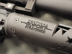
We recently completed a logo design for Tactical Export Strategies, an Idaho company that assists firearm manufacturers in compliance and logistic issues regarding shipping to other countries.
Tactical Export Strategies (TES) is registered with the ATF (U.S. Dept. of Justice) and the DDTC (U.S. State Dept.) for export and import of defense articles and services (Firearms, Military Equipment, Ammunitions, Militarized Technology, etc.).
The logo was designed so that it could also be used to “brand” onto products that TES partners with, such as the creation of an “All Idaho Gun”, which will make it’s debut at the 2015 Shot Show in Vegas.
As you can imagine, we deal with a lot of different web hosting companies while creating sites for clients. For a time, we even tried our hand at being a web host ourselves. We leased a server, installed the billing software and for a little over a year and a half, dealt with tech support issues, sites being down, email issues and generally the stuff that we were not good at. The last straw for our “web hosting division” was when our leased VPS went down and we were told we needed to switch to a dedicated server. Apparently, this process takes about a week. Now whether it really takes a week or not I don’t know, because we’re creative folks, not technical folks. What I do know is that we were very popular for that week, and not in a good way. See, people get kind of attached to their websites being up and accessible to clients and customers. When they’re not, they get pissed. And I didn’t blame them one bit. I was pissed too, because all of our sites were down as well. No sites, no email, no good.
I quickly began searching for an alternative, because I knew that I was going to be out of the web business after this. My previous hosting company managed to get everyone back up on a “temporary” basis after about 5 days so during the downtime I started researching hosting companies. If you’re just beginning this process take my advice: do more than price shop. Most hosting companies make about the same offer for shared hosting platforms, anywhere from $3 to $10 dollars a month. However, price per month should only be one of the things you consider. In my opinion, tech support is the real key to a money/value web host comparison. You see, the rubber really meets the road when you have technical issues. How fast does the company respond to support tickets? How fast do they answer live chat?
In my search for a new company, I’m pleased to say that I found the answer to my hosting needs. InMotion Hosting. They are a U.S. based (data centers on both coasts) employee owned and operated company. Employee owned and operated? Yeah, that means they care. They care because it’s in their best interest to make sure that if you have a problem, the issue gets resolved. I’ve been with them for over two months now and have had interaction with tech support via phone 3 times and via chat support 3 times. Whether it was by phone or chat, the issue was resolved quickly, and I love the fact that at the end of your session, tech support asks you to email their boss and let them know how they performed. My previous company didn’t do that. They took 2 days or more to even answer an initial request and then 2 or more days to resolve it. No bueno.
It’s not fun to think about switching host providers. We’d been with our previous web host for over 2 years. But somewhere along the way with our old provider, the tech support dropped off while the tech issues (sites going down) kept escalating. InMotion made it easy to switch and move all of our data, (and data from the clients who also switched to them).
If you’re looking for a reliable web hosting company, with customer service rock stars, check out InMotion by clicking their banner below.
Recently completed a logo and website rebranding for Empower Boise, an experiential training and effectiveness seminar located in Boise, Idaho. Their old logo had many elements going on, and was intended to capture the story of the boy throwing starfish back into the ocean (if you don’t know the story you can look it up). Our job was to create a cleaner, more effective logo that would be used on their website and marketing materials. We chose a stronger font for “empower” and then incorporated the starfish into the “o” to create a cohesive logo that projects the image of “empowerment”. Take a look at the before and after, and if you’re interested in the training, visit www.empowerboise.com.
With the World Cup still in full swing Chevrolet and Manchester United star in this great video showing the history of the Manchester United jersey. The Manchester fans sing “Glory Glory Man United” as they march to the stadium, where star Wayne Rooney debuts the latest jersey with the Chevrolet logo and ends by saying, “This shirt belongs to you. Always has. Always will.” A great spot by Chevy’s agency Commonwealth.
Thanks to Derrick Boles and his Stand Up America campaign for choosing us to create the new logo for their marketing and branding efforts.
Stand Up America has a primary mission to challenge, educate, inspire and mobilize community based organizations and leaders to “Stand Up “for community empowerment. Our goal is to provide collaboration opportunities, training, technical assistance and funding opportunities for underrepresented populations across America.
Graphic Zen’s job was to take the elements that Derrick envisioned for the Stand Up America logo, (map of America, organization name, Christian reference and “the pinkie) and incorporate into a logo that could be used for their ongoing awareness campaign. The pinkie is the first of five fingers that represent concepts in the Stand Up America campaign, in this case the pinkie represents “Courage”, as it only take the effort of raising your pinkie to take action and make a difference in your community.
After sketching a few concepts, I gradually developed this logo, using the elements described above to create the map of America. The rough font for “Stand” represents that we must stand where we are (circumstances/location) and be who we are. It also includes the Christian reference in the cross-like “T” in Stand. The five stars represent the five fingers that will be defined as the campaign goes on. The pinkie logo is represented and takes the place of the northeastern part of the U.S. while the rest of the organization name takes on the shape of the U.S.
A challenge to create, and very well worth the time!
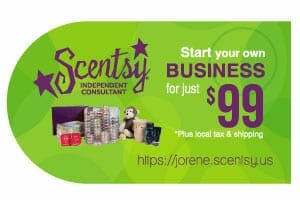
I’m often asked if I design business cards. Of course! In fact, business cards these days need not be the typical rectangle shape. If you’re willing to spend a little more for design and printing, we can create an effective marketing tool for your business cards. Check out the samples here, for Scentsy Independent Consultant Jorene Batali. Jorene wanted something that featured her picture, info on her business and also stand out from other cards. We created these colorful two-sided cards (why you would only use one side of the card I’ll never know, must be a designer thing) that contain all the marketing and contact details for Jorene. It has her picture, contact info and the back features product images, the cost to join Scentsy and Jorene’s web address.
The cost to design these cards ran about $300 and printing 1,000 cards with a gloss front and back was around $90. I believe the cards have been effective for Jorene as she just ordered another 1,000 cards. In case you’re wondering, the $300 was for the initial setup, if Jorene had to make changes to the card (phone number, email) we would not charge for a simple change – that’s part of extending good customer service to our clients. It’s quick and easy to modify the file, and we don’t see the need to charge for a small change like this. If you’re interested in having us design some cards or other materials for you, or would like a quote, contact us.