The Blog
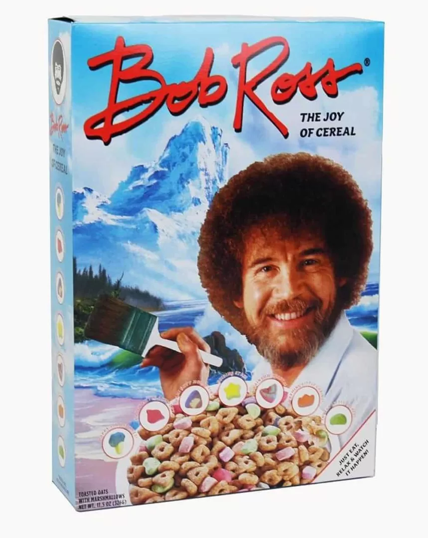 It's art! It's cereal! It's both! If you remember the soothing voice of Bob Ross, then just add milk to this add listen to him talk as you eat. Okay, that's not going to happen. But you can still enjoy some cereal inspired by the guy that inspired many artists.…
 I know, I know, it's insurance. But hey, somebody's got to do it, right? And if you need insurance wouldn't you want to work with a company that looks out for you, finds you the best deal and does it at no cost to you? That's what Insurers of Idaho…
Warning: Undefined array key "width" in /home/graphi79/public_html/wp-includes/media.php on line 1483
Warning: Undefined array key "width" in /home/graphi79/public_html/wp-includes/media.php on line 1488
Warning: Undefined array key "height" in /home/graphi79/public_html/wp-includes/media.php on line 1488
 Clients often wonder when it's time to change, or update their logo. Do you evolve your logo (change it slightly)? Or do you revolutionize your logo, and come up with something completely different? Below are two examples of evolving and revolutionizing a logo. First we have CBS Sports, which evolved…
Warning: Undefined array key "width" in /home/graphi79/public_html/wp-includes/media.php on line 1483
Warning: Undefined array key "width" in /home/graphi79/public_html/wp-includes/media.php on line 1488
Warning: Undefined array key "height" in /home/graphi79/public_html/wp-includes/media.php on line 1488
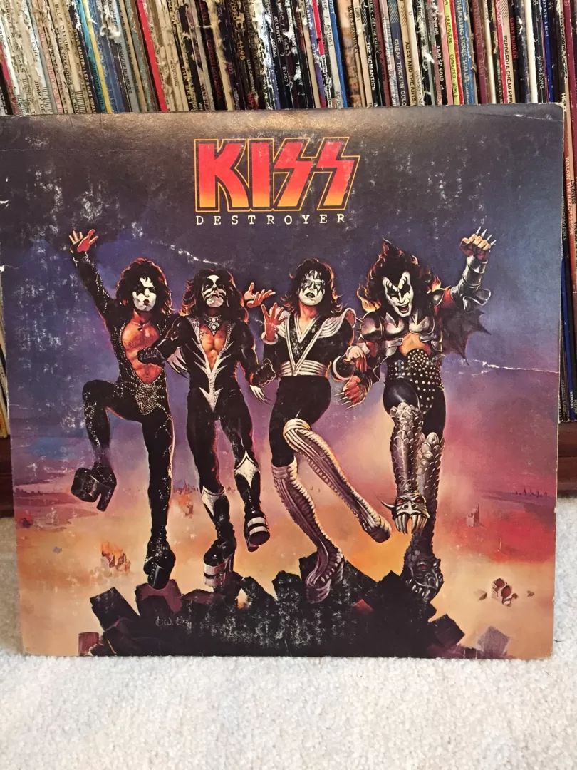
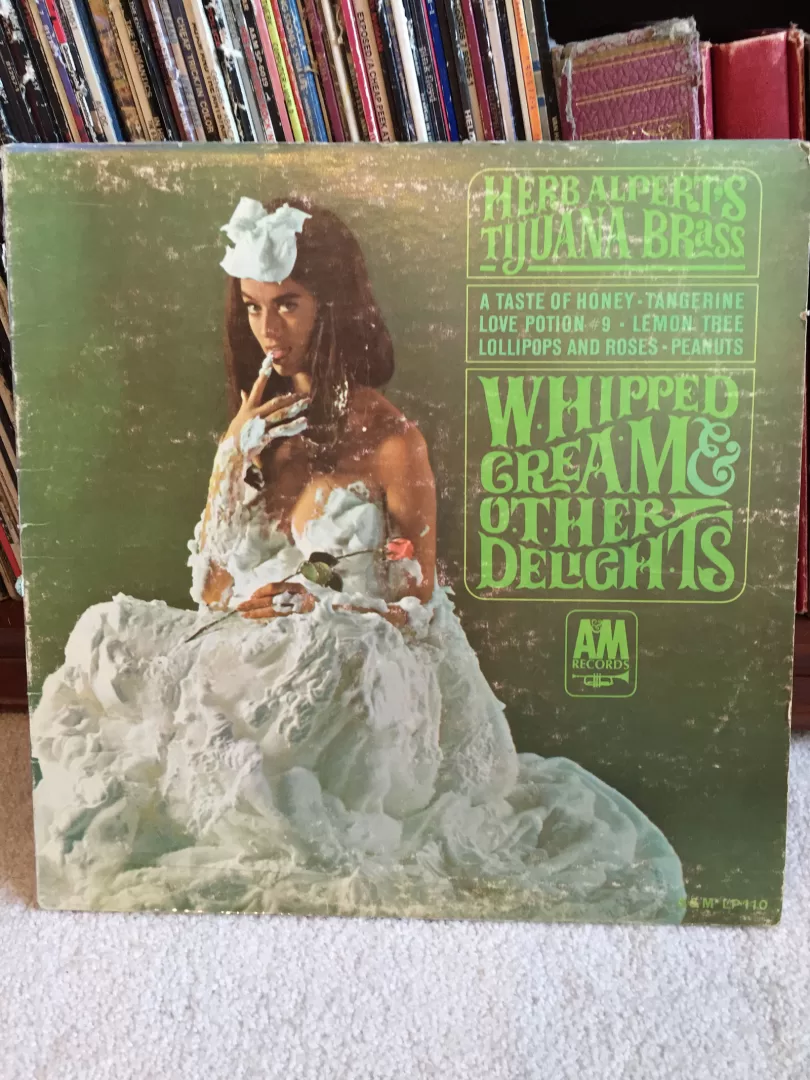
I was texting with a friend the other day who said he was glad my business was going well. Jokingly, I replied that my boss was a jerk (I’m self-employed) and that I was too hard on myself. He replied, “You should fire that guy.” You know what? He was… Continuing with (IMO) great and iconic album covers, I present to you Destroyer from “the hottest band in the land” KISS. Destroyer came on the heels of their worldwide hit KISS ALIVE!, which was the biggest selling live album in history. Knowing that the follow up album to this had…
Warning: Undefined array key "width" in /home/graphi79/public_html/wp-includes/media.php on line 1483
Warning: Undefined array key "width" in /home/graphi79/public_html/wp-includes/media.php on line 1488
Warning: Undefined array key "height" in /home/graphi79/public_html/wp-includes/media.php on line 1488
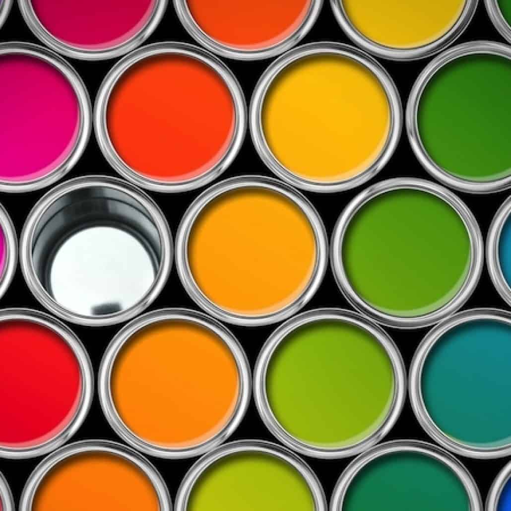
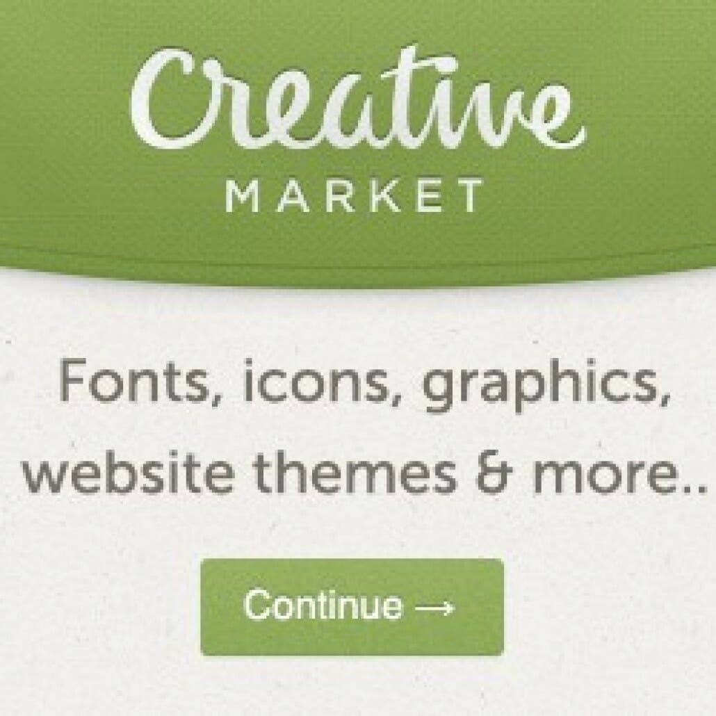
So you’ve got your company name for your business and are ready to meet with a designer to get all those logo ideas down on paper so you can launch your business to the world. Have you considered how important color is when establishing your brand/logo? You see, if you're…- As a designer, we usually have several sources for fonts, vector images and stock photos. If you're looking for a great source for fonts, images, vectors and Photoshop Actions, I highly recommend Creative Market. As per their website: "Creative Market is a platform for handcrafted, mousemade design content from independent…
- One of the things that has always been on my design bucket list is to design an album cover. Not just any album cover, an iconic album cover. Besides design, one of my other passions is music. I played drums in a few bands in my teenage years up to…
 I'm extremely proud that Graphic Zen was chosen to create the new brand identity for the Meridian Chamber of Commerce. The project was very rewarding to work on, as I live and work in the Meridian community, and love my city. After initial concepts were created about 4 months ago,…


 It's art! It's cereal! It's both! If you remember the soothing voice of Bob Ross, then just add milk to this add listen to him talk as you eat. Okay, that's not going to happen. But you can still enjoy some cereal inspired by the guy that inspired many artists.…
- I know, I know, it's insurance. But hey, somebody's got to do it, right? And if you need insurance wouldn't you want to work with a company that looks out for you, finds you the best deal and does it at no cost to you? That's what Insurers of Idaho…
- http://www.zdnet.com/article/google-reportedly-launching-daydream-vr-in-coming-weeks/
Warning: Undefined array key "width" in /home/graphi79/public_html/wp-includes/media.php on line 1483
Warning: Undefined array key "width" in /home/graphi79/public_html/wp-includes/media.php on line 1488
Warning: Undefined array key "height" in /home/graphi79/public_html/wp-includes/media.php on line 1488
Clients often wonder when it's time to change, or update their logo. Do you evolve your logo (change it slightly)? Or do you revolutionize your logo, and come up with something completely different? Below are two examples of evolving and revolutionizing a logo. First we have CBS Sports, which evolved…
Warning: Undefined array key "width" in /home/graphi79/public_html/wp-includes/media.php on line 1483
Warning: Undefined array key "width" in /home/graphi79/public_html/wp-includes/media.php on line 1488
Warning: Undefined array key "height" in /home/graphi79/public_html/wp-includes/media.php on line 1488
I was texting with a friend the other day who said he was glad my business was going well. Jokingly, I replied that my boss was a jerk (I’m self-employed) and that I was too hard on myself. He replied, “You should fire that guy.” You know what? He was…- Continuing with (IMO) great and iconic album covers, I present to you Destroyer from “the hottest band in the land” KISS. Destroyer came on the heels of their worldwide hit KISS ALIVE!, which was the biggest selling live album in history. Knowing that the follow up album to this had…
Warning: Undefined array key "width" in /home/graphi79/public_html/wp-includes/media.php on line 1483
Warning: Undefined array key "width" in /home/graphi79/public_html/wp-includes/media.php on line 1488
Warning: Undefined array key "height" in /home/graphi79/public_html/wp-includes/media.php on line 1488
So you’ve got your company name for your business and are ready to meet with a designer to get all those logo ideas down on paper so you can launch your business to the world. Have you considered how important color is when establishing your brand/logo? You see, if you're…- As a designer, we usually have several sources for fonts, vector images and stock photos. If you're looking for a great source for fonts, images, vectors and Photoshop Actions, I highly recommend Creative Market. As per their website: "Creative Market is a platform for handcrafted, mousemade design content from independent…
- One of the things that has always been on my design bucket list is to design an album cover. Not just any album cover, an iconic album cover. Besides design, one of my other passions is music. I played drums in a few bands in my teenage years up to…
- I'm extremely proud that Graphic Zen was chosen to create the new brand identity for the Meridian Chamber of Commerce. The project was very rewarding to work on, as I live and work in the Meridian community, and love my city. After initial concepts were created about 4 months ago,…
- Pop the champagne! Or wine (or your favorite beverage), because Getty Images is saving you from ripping off images on the interwebs. You can now embed Getty Images into your website, blog or social platform without feeling guilty for pirating images. From Getty Images, "Finally, everyone can enhance their online…
- Would you work for free? If you do creative work (designer, artist, coder) you may have seen something like the following example that I see far too often in online forums, direct emails, or via face-to-face networking. It goes something like this: I have a small business and I would…
Warning: Undefined array key "width" in /home/graphi79/public_html/wp-includes/media.php on line 1483
Warning: Undefined array key "width" in /home/graphi79/public_html/wp-includes/media.php on line 1488
Warning: Undefined array key "height" in /home/graphi79/public_html/wp-includes/media.php on line 1488
Seattle Seahawks quarterback Russell Wilson (congratulations on the Super Bowl win!) recently asked followers to submit logo ideas for his DangeRussWilson brand. I created a few logo concepts and received thumbs up from a couple of Seahawk fans. It's kind of hard to design something without a design brief/direction, so…- With all the dialogue (arguing?) going on these days on topics political/social/sports etc., it's always a good idea to bring things back into perspective. “Look again at that dot. That's here. That's home. That's us. On it everyone you love, everyone you know, everyone you ever heard of, every human…
Warning: Undefined array key "width" in /home/graphi79/public_html/wp-includes/media.php on line 1483
Warning: Undefined array key "width" in /home/graphi79/public_html/wp-includes/media.php on line 1488
Warning: Undefined array key "height" in /home/graphi79/public_html/wp-includes/media.php on line 1488
So as part of my goal to express myself creatively this year (I get to express creatively for everyone else most of the time), I've submitted my first design at Threadless.com. You can see the design here, and I'd be most appreciative if you'd click this link and vote a…- How do you share your blog posts with your audience? We are currently testing a service called dlvr.it (Deliver It) to see how well the service handles blog posts and places them into our social media accounts automatically. We were using Twitterfeed, though lately their service has been pulling old…
- Merry Christmas and all the seasonal greetings that come with this time of year. As we look forward to 2012, Graphic Zen will be debuting a revamped website, (work continues on it now), and some new service offerings. In the meantime, we hope you enjoy the "snow" that is gently…
- Have you always wanted to make your own animated film? Dream of becoming the next Disney or Pixar? Just found a great resource for learning 3D animation. Check it out - Click Here!
- Can vehicles be considered art? Watched an episode of "Top Gear" the other night and the hosts entertained the topic, going so far as to set up their own exhibition of what they considered art at a local museum. Of course, it was Top Gear so it was all a…
- Created a new look for Meridian Food Bank recently and will be utilizing it on their new website as well. The client stressed that it was important to keep the "bowl theme", because that was a strong memory for he and his wife from their missionary work. "Too many empty…
- My apologies (I'm sorry!) to all Tweeters out there, especially my followers, for my repetitive Nigerian bank scam tweet. I'm sure it was funny the first few hundred times you saw it. :-0 See, I was trying out a tweeting software to schedule tweets and added that one. Instead of…
- Okay, I must admit that I rarely pay attention to the drugs being marketed on television. The supposed cure for an ailment usually comes with a litany of side effects, many that seem worse than the original "problem". I would love to design a logo and help craft a name…
- Just finished the "Safe At University" site - located at: www.safeatuniversity.com. This is a site dedicated to student safety while attending college or university. The guide is filled with tips for parents and students on dealing with various campus and off campus safety situations. Please visit!
- Cross one off the "bucket list". Finished the Seattle Rock 'n Roll Marathon on June 27th. To make it even better, proposed to my girlfriend afterwards! Now back to work!
- Or should I say "The Fewd Network"? Appears they are working the staff too hard, or they don't hold the production staff to the same exacting 'You've got to get this right' mentality that I see being preached on The Next Food Network Star. Don't get me wrong - I…
- Attention entrepreneurs/business owners: what business are you in? Attended a great business seminar today and was asked that question by one of the speakers. If you answered, "I'm in _____ business", chances are that you are not as successful as you should be. The speaker challenged us to think that…
- Training continues for the Seattle RNR Marathon. Did 14 miles last Saturday and came to the realization that this is eating up a lot of life. Eat, run, sleep. Occasionally get some work in. How you runners do it? Going to try tweaking the diet a bit to gain some…
- Not you? Then I suggest you watch a Japanese movie called "Pray". It will give you the screamin' heebie jeebies. Some of the last few big "horror hits" in the U.S. were actually remakes of Japanese horror films - "The Ring" for example. I actually find the Japanese version scarier.…
- What is it about April that makes me want to go out and play golf? If it weren't for the rain, wind and hail, I'd probably be out on the course. Noonan!
- Have recently received numerous requests from new/small business regarding my services. I like the pioneering spirit of the entrepreneur! Despite government interference, we (small business) will rise from the ashes of layoffs, downsizing, bankruptcy, etc., to forge a new product, industry or service! Power to the business people. Amen.
- Training continues for the Seattle Rock & Roll Marathon in June. I decided today after a great conversation with a friend that I'm only doing part of the run for me. I'm mostly doing it for the folks that aren't able to - cancer patients/other terminally ill patients. People who…
- I believe that in a typical 24-hour period, the movie "Die Hard" can be found on one of your tv channels. Wonder if Bruce Willis watches to remember what his hair looked like?