Graphic Design
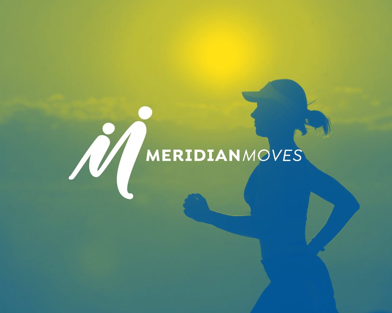 Super excited to reveal the new logo we designed for the Meridian Moves initiative, which is managed through the Meridian Library District. Meridian Moves is a city-wide health and wellness initiative, to encourage folks to move more. The logo is designed to represent the physical and active movement of the…
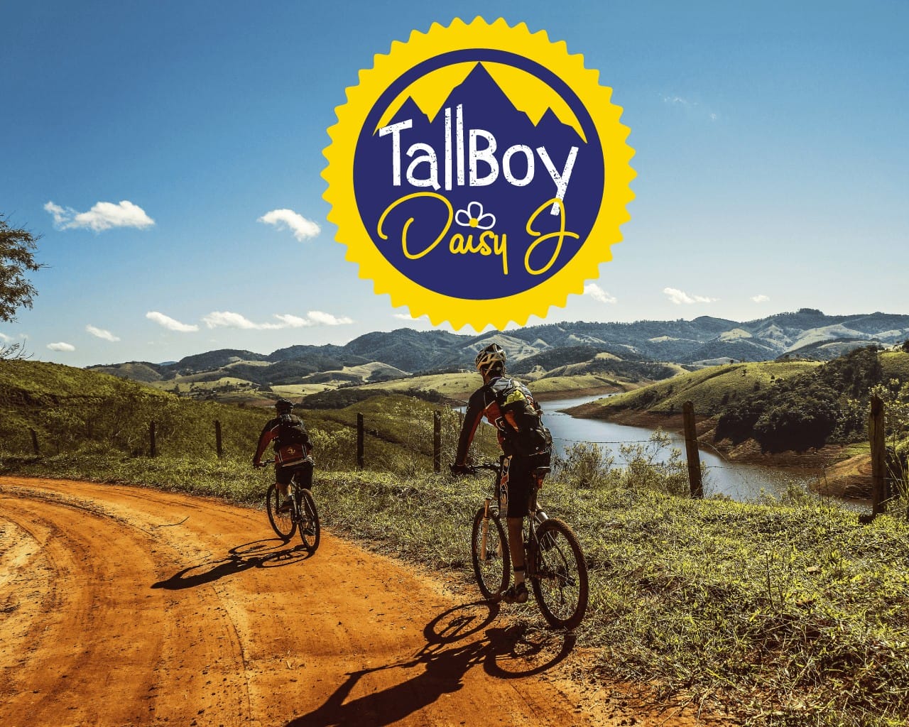 Just finished up a new logo for a blogger and adventure traveler: TallBoy and DaisyJ. This couple travels the U.S. and internationally on exciting mountain bike tours, and Daisy J loves to write about it. In her words, Years ago when I was working long hours and filling my time…
Warning: Undefined array key "width" in /home/graphi79/public_html/wp-includes/media.php on line 1483
Warning: Undefined array key "width" in /home/graphi79/public_html/wp-includes/media.php on line 1488
Warning: Undefined array key "height" in /home/graphi79/public_html/wp-includes/media.php on line 1488
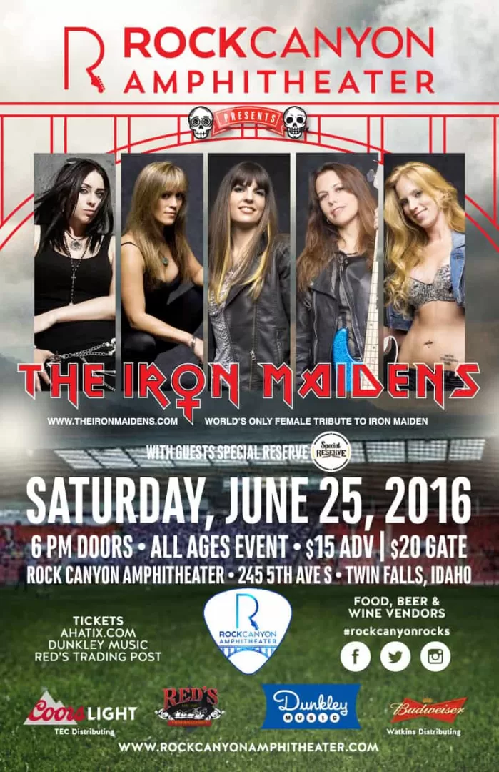
 Last year we created a logo for Rock Canyon Amphitheater in Twin Falls, Idaho. This year we got to create a poster for one of their upcoming events, for an Iron Maiden tribute band. Now, you may be thinking, "Why would I go see an Iron Maiden tribute band?" I…
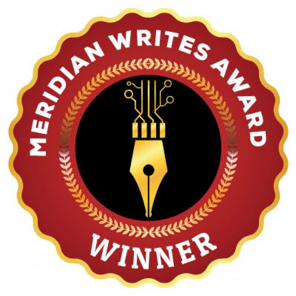
 Projects sometimes come with no set of guidelines or creative brief. I can be free to explore and develop concepts without feeling like I'm straying from a set of rules. That's cool. This was the case with a recent project from the Meridian Library District, and their Meridian Writes program.…
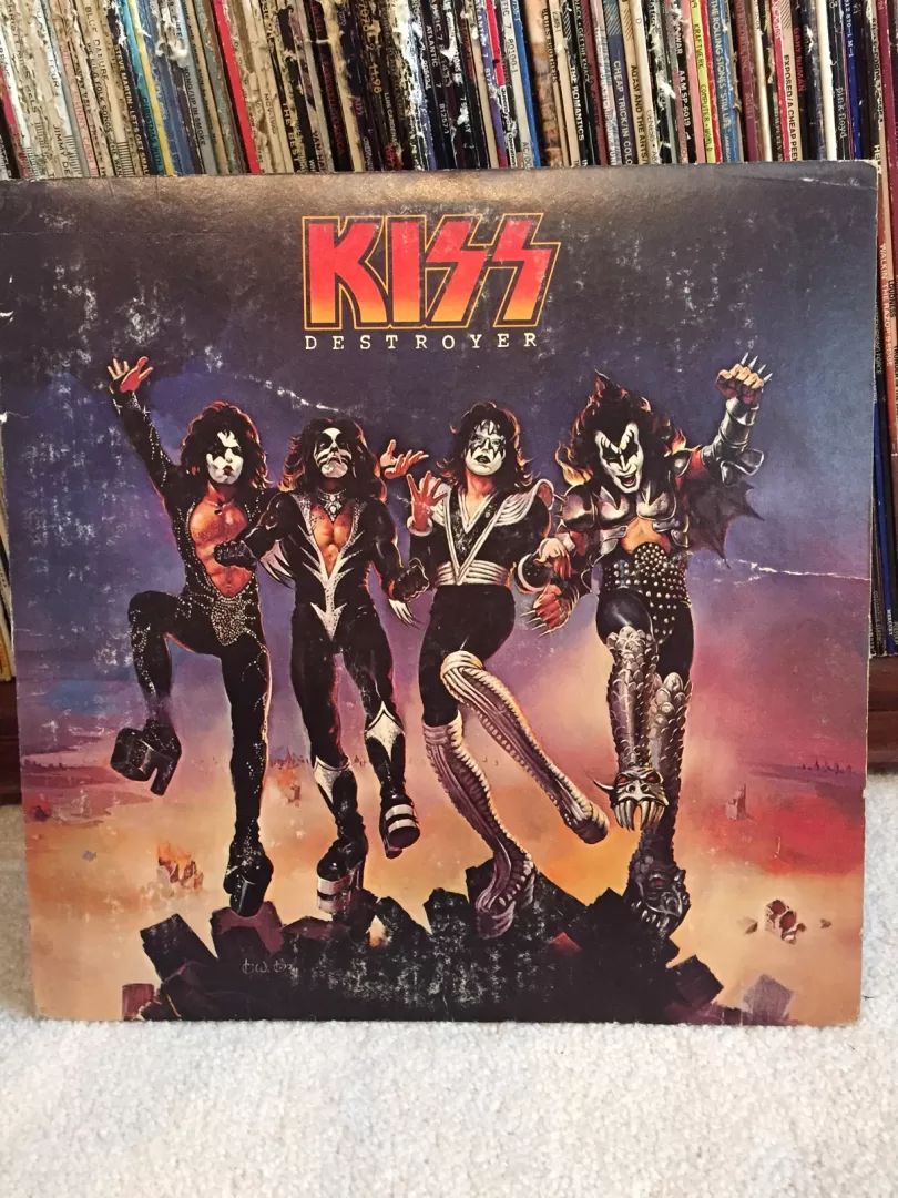
 Continuing with (IMO) great and iconic album covers, I present to you Destroyer from “the hottest band in the land” KISS. Destroyer came on the heels of their worldwide hit KISS ALIVE!, which was the biggest selling live album in history. Knowing that the follow up album to this had…
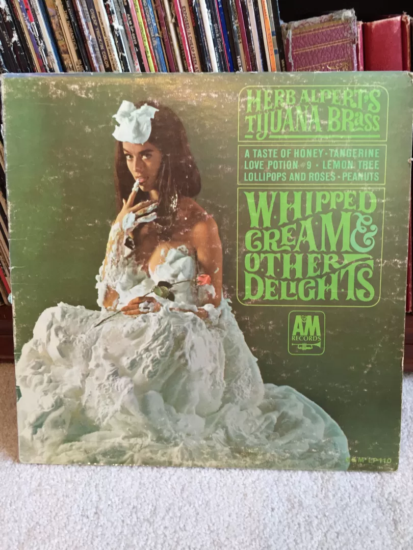
- One of the things that has always been on my design bucket list is to design an album cover. Not just any album cover, an iconic album cover. Besides design, one of my other passions is music. I played drums in a few bands in my teenage years up to…
 I'm extremely proud that Graphic Zen was chosen to create the new brand identity for the Meridian Chamber of Commerce. The project was very rewarding to work on, as I live and work in the Meridian community, and love my city. After initial concepts were created about 4 months ago,…
 Super excited to reveal the new logo we designed for the Meridian Moves initiative, which is managed through the Meridian Library District. Meridian Moves is a city-wide health and wellness initiative, to encourage folks to move more. The logo is designed to represent the physical and active movement of the…
- Just finished up a new logo for a blogger and adventure traveler: TallBoy and DaisyJ. This couple travels the U.S. and internationally on exciting mountain bike tours, and Daisy J loves to write about it. In her words, Years ago when I was working long hours and filling my time…
- http://ilovetypography.com/the-font-wall/
- https://www.fastcodesign.com/3063124/evidence/were-only-just-beginning-to-understand-how-color-impacts-users
Warning: Undefined array key "width" in /home/graphi79/public_html/wp-includes/media.php on line 1483
Warning: Undefined array key "width" in /home/graphi79/public_html/wp-includes/media.php on line 1488
Warning: Undefined array key "height" in /home/graphi79/public_html/wp-includes/media.php on line 1488
Last year we created a logo for Rock Canyon Amphitheater in Twin Falls, Idaho. This year we got to create a poster for one of their upcoming events, for an Iron Maiden tribute band. Now, you may be thinking, "Why would I go see an Iron Maiden tribute band?" I…- Projects sometimes come with no set of guidelines or creative brief. I can be free to explore and develop concepts without feeling like I'm straying from a set of rules. That's cool. This was the case with a recent project from the Meridian Library District, and their Meridian Writes program.…
- Continuing with (IMO) great and iconic album covers, I present to you Destroyer from “the hottest band in the land” KISS. Destroyer came on the heels of their worldwide hit KISS ALIVE!, which was the biggest selling live album in history. Knowing that the follow up album to this had…
- One of the things that has always been on my design bucket list is to design an album cover. Not just any album cover, an iconic album cover. Besides design, one of my other passions is music. I played drums in a few bands in my teenage years up to…
- I'm extremely proud that Graphic Zen was chosen to create the new brand identity for the Meridian Chamber of Commerce. The project was very rewarding to work on, as I live and work in the Meridian community, and love my city. After initial concepts were created about 4 months ago,…
- We recently had the chance to create a fun ad design for a fellow creative, Cliff Marks Jr. Photography. Cliff is the exclusive photographer for the Treasure Valley Children's Theater and this fun shot of 'Alice in Wonderland' that we used for the ad is perfect to show the fun…
- Are you ready to Stand Up America? On December 7, 2012 one of our clients, Derrick Boles began a journey of more than 1800 miles. Derrick and his Stand Up America campaign is an inspiring journey. Using an Elliptigo cycle, Derrick will ride from San Diego to New Orleans, with…
- Very happy to announce our working partnership with Derrick Boles and the L.E.A.D.E.R.S.H.I.P. 1st for America organization. Leadership 1st's mission is to engage, empower, educate and mobilize community based organizations through training, technical assistance and fund raising opportunities. We recently completed the first phase of their fundraising division, located at…
- Just finished up a website for Independent Scentsy Consultant, Lisa Nelson. This site will be used by Lisa as a marketing and lead generation tool for prospective consultants and customers. This was a great site to work on because it educated us about the fantastic products and the story of…
- Was asked by a friend the other day over coffee how we get ideas for clients, or what is the process that leads us to create a design for the client. This quote below from Paul Rand is a great summary and description of what I sometimes call 'creating order…
- Graphic Zen would like to welcome Richard “Chad” Villapando to our development team. Chad is a talented and experienced website coder and will be one of the lead developers for our web division. He’s developed a wide range of websites using HMTL, CSS and WordPress including sites for start up…
- Looking to save some money on product creation tools? This guide will show you where to get photo editing software, PDF converters and editors, form fillers, image editors, background makers, logo generators, word processors, spreadsheets and more! We used to sell this guide, now we're going to be giving it…
- Looking for photo editing software? Don't want to shell out the big bucks for Photoshop? Try Sumo Paint. If you're expecting online image editors to be anemic, you'll be surprised by the extensive features of many of the nominees like Sumo Paint. Sporting a toolbar, image navigator, swatches, and layers,…
- We’ve always used the analogy that building a website is like building a home. Imagine that you’ve just purchased ten acres of beautiful land, and you hire the best builder in the area to construct your home. You drive the builder out to your land and point to a spot…
- The font is a critical factor in creating a website. For one, it will either make it easy or difficult for your readers to read the content of your website. Another thing is that, it also says a lot in the overall design of your website. It is therefore important…
- A good graphic designer is able to create great designs long after the latest design fads have passed. It is true that becoming good at web designing takes years of experience. However, it is also rooted in learning the fundamentals well. Time has proven that the basics work and they…