Creative Process
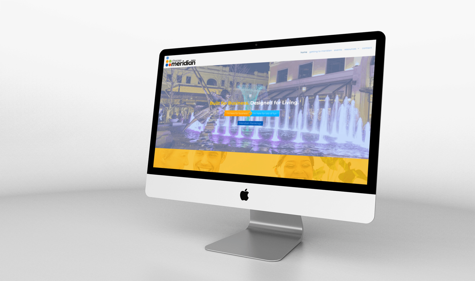 Welcome to the interwebs Choose Meridian! This project was a logo and website to benefit the Meridian Chamber of Commerce and the City of Meridian, Idaho. We collaborated with the Meridian Chamber of Commerce to create an identity that would complement the Chamber brand identity we designed a couple of…
Warning: Undefined array key "width" in /home/graphi79/public_html/wp-includes/media.php on line 1463
Warning: Undefined array key "width" in /home/graphi79/public_html/wp-includes/media.php on line 1468
Warning: Undefined array key "height" in /home/graphi79/public_html/wp-includes/media.php on line 1468
 So you’ve got your company name for your business and are ready to meet with a designer to get all those logo ideas down on paper so you can launch your business to the world. Have you considered how important color is when establishing your brand/logo? You see, if you're…
Warning: Undefined array key "width" in /home/graphi79/public_html/wp-includes/media.php on line 1463
Warning: Undefined array key "width" in /home/graphi79/public_html/wp-includes/media.php on line 1468
Warning: Undefined array key "height" in /home/graphi79/public_html/wp-includes/media.php on line 1468
 I think it's amazing sometimes that people in the same line of work find themselves on a similar path. Kim Doyal, aka "The WordPress Chick" recently posted her manifesto after experiencing some "creative frustration" (my interpretation). She inspired me to create my own manifesto, which I've added here. It doesn't…
 Welcome to the interwebs Choose Meridian! This project was a logo and website to benefit the Meridian Chamber of Commerce and the City of Meridian, Idaho. We collaborated with the Meridian Chamber of Commerce to create an identity that would complement the Chamber brand identity we designed a couple of…
- https://www.fastcodesign.com/3063124/evidence/were-only-just-beginning-to-understand-how-color-impacts-users
Warning: Undefined array key "width" in /home/graphi79/public_html/wp-includes/media.php on line 1463
Warning: Undefined array key "width" in /home/graphi79/public_html/wp-includes/media.php on line 1468
Warning: Undefined array key "height" in /home/graphi79/public_html/wp-includes/media.php on line 1468
 So you’ve got your company name for your business and are ready to meet with a designer to get all those logo ideas down on paper so you can launch your business to the world. Have you considered how important color is when establishing your brand/logo? You see, if you're…
Warning: Undefined array key "width" in /home/graphi79/public_html/wp-includes/media.php on line 1463
Warning: Undefined array key "width" in /home/graphi79/public_html/wp-includes/media.php on line 1468
Warning: Undefined array key "height" in /home/graphi79/public_html/wp-includes/media.php on line 1468
 I think it's amazing sometimes that people in the same line of work find themselves on a similar path. Kim Doyal, aka "The WordPress Chick" recently posted her manifesto after experiencing some "creative frustration" (my interpretation). She inspired me to create my own manifesto, which I've added here. It doesn't…
- Was asked by a friend the other day over coffee how we get ideas for clients, or what is the process that leads us to create a design for the client. This quote below from Paul Rand is a great summary and description of what I sometimes call 'creating order…
