
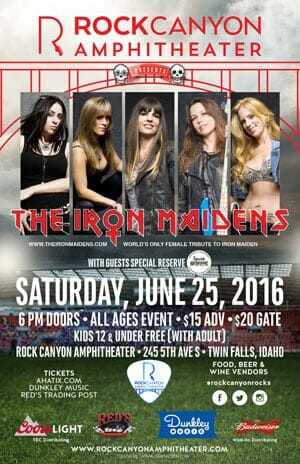
 Last year we created a logo for Rock Canyon Amphitheater in Twin Falls, Idaho. This year we got to create a poster for one of their upcoming events, for an Iron Maiden tribute band. Now, you may be thinking, “Why would I go see an Iron Maiden tribute band?” I thought of a few different ways that I could describe the band to you, and the one that kept shouting loudest was a younger version of myself, say early 20’s. That version of me was shouting, “THIS IS SO COOL! THIS IS A BAND OF TALENTED HOT CHICKS THAT PLAY IRON MAIDEN!! HOW COOL IS THAT?!? Indeed, it is cool. The Iron Maidens can shred with the best of them, and on June 25 the city of Twin Falls will be rockin’. So if you’d like to treat your younger self to an Iron Maidens concert, I suggest that you get yourself over to www.rockcanyonamphitheater.com for tickets and more info. And if you want to check out the poster for the event, it’s there to the left, because I know that you read this before you looked at the poster, right?
 Rudy Vaughn
Do you care? (About your website?)
WordPress now powers about 25% of sites on the interwebs. Its ease of use, flexibility and power have made it a go-to choice for many business owners.
Do you have a WordPress website? Do you know a business owner with a WordPress website? Is your care plan up to date?
Yeah, your care plan. It’s no good having a shiny, new website that stops working for you because it gets hacked, or has outdated software. Or think of it this way, how much business (ahem, money!) would you lose if your site was down for a day? Three days? A week?
At Graphic Zen, we provide our Client Care Plans to business owners and individuals who care about the results of their website. These clients want to focus on their businesses and not the tasks of keeping a website updated.
So what do our plans provide? In addition to core CMS updates, security monitoring and backups:
- We provide and add value to your website.
- We provide support to you and your team to make sure your site is up-to-date and running.
- We help identify new projects for you so you can stay ahead of your competition
In addition, if you are on a client care plan we are able to offer strategy consulting on:
- Social Media Integration
- YouTube/video
- Google Analytics
- SEO/Content Marketing
- And more
You can find more information about our care plans (and share it with your friends), at: https://graphiczen.com/client-care-plans
Nagel Foundation
Our latest project is done and live on the interwebs! Extremely grateful to the entire Nagel Foundation Board of Directors, for collaborating on the process of developing a new brand identity mark and website.
The Nagel Foundation story started with a German immigrant who bought a soda-water company for $700 in 1895 that serviced ten saloons in downtown Boise, and turned it into a thriving business.
In 2009 after the Nagel family sold their business, they established the Nagel Foundation with the mission to support human needs such as medical treatment, food needs, and youth education.
To read more about the project and view before and after images, visit the project page here: https://graphiczen.com/nagel-foundation/
Graphic Design: Meridian Writes Program Medal
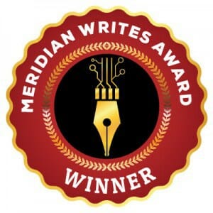 Projects sometimes come with no set of guidelines or creative brief. I can be free to explore and develop concepts without feeling like I’m straying from a set of rules. That’s cool. This was the case with a recent project from the Meridian Library District, and their Meridian Writes program.
This program was created to highlight the talent and work from Meridian authors. Authors who live in the Meridian city limits or library boundary district can submit work for review by library staff. The staff will select three finalists and then ask select members of the Meridian community to choose a winner.
I initially started creating a traditional “medal” award type of graphic, complete with gold or silver accents and somewhere in the process I thought, “Why does it have to be round like a coin?” So after thinking about some shapes, I decided to go with something different, yet still “roundish”. For the center graphic, I experimented with different type styles and images, including a tree and the calligraphy nib you see here. I decided to add the digital-like element as part of the calligraphy pen to represent the fact that we now live in a digital age where books are often created and read via computer and tablet or phone, yet the art of writing began and still continues with putting pen to paper.
Of the five designs submitted, the Library choose the one you see here. I hope the participants of this new program continue to work and enjoy their creative craft, much like graphic designers do. 🙂
Logo Design: Why change?
Clients often wonder when it’s time to change, or update their logo. Do you evolve your logo (change it slightly)? Or do you revolutionize your logo, and come up with something completely different?
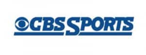
Below are two examples of evolving and revolutionizing a logo.
First we have CBS Sports, which evolved their sports logo, which had been in use for 37 years. You’ll notice the new logo is much cleaner, though I’m not in favor of the gradient fade to the new logo. This logo lasted CBS 37 years, which is a pretty good run for a sports/media logo.

Which brings us to the question, “How do you know it’s time to change your logo?”
Well, think about your company. Have you changed your core business? Maybe you started out manufacturing a product and found that providing a service for your industry was a better business model for you. That might warrant a logo change. Have your employees or vendors expressed the idea that your logo might be out of date?
This brings us to our second example; a total revolution of a logo.
Segundo Mano recently changed their name to Vibbo. Segundo Mano (Spanish for Second Hand) is like a Craigslist for Spain. The parent company made the decision on the name change and the logo was designed by Barcelona-based Summa.
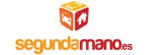
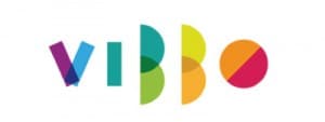
As you can see, the new logo retains nothing of the past logo. It’s bold, colorful and very simple in execution, comprised of just rectangles and half circles to form the letter shapes. It’s a very cool logo.
You may be thinking ‘why did they change their name’?. And that’s the key to communicating to your key people, employees, vendors and your customers – “WHY?”. If you can let everyone know why you made the change (or why you’re considering the change), you’re likely to get more constructive feedback and acceptance. People don’t like change, and I think they are more accepting to it if they know the reason why. They may not agree with it, but they will understand the reasoning behind the decision.
We always start out by asking ‘why?’ to our clients. Why do you need a new logo? Why do you need a new website? Uncovering the reasons behind wanting a change often reveals what’s really going on in your business, and it may involve more than a re-brand. It may a bigger issue that you need to focus on.
If you’d like help discovering your why, and get our help in creating something awesome for you, contact us to schedule a consultation.
Logo Design: Dream Possible!
![]() The latest client logo is for Jorene Batali, an Independent Scentsy Consultant. Scentsy is direct selling company that offers a variety of home and personal fragrance products, including scented wickless candles and decorative ceramic warmers, which together provide a safer alternative to burning wicked candles.
The latest client logo is for Jorene Batali, an Independent Scentsy Consultant. Scentsy is direct selling company that offers a variety of home and personal fragrance products, including scented wickless candles and decorative ceramic warmers, which together provide a safer alternative to burning wicked candles.
To create this logo I concentrated on a few core elements that Jorene suggested – bright colors, and her team name (Scentsy consultants and their downline, or team members, like to create unique and inspirational team names to distinguish themselves from other teams). Jorene’s team is known as Team “Dream Possible!” because she says when you dream your big goals, you should dream possible. In addition a butterfly was suggested as this is a personal symbol that holds importance to Jorene, because it symbolizes, change, growth, beauty, and freedom.
The butterfly icon/wings symbolize both the “dp” for her team name, “Dream Possible!” and can also be her initials, “JB”. This logo can support a wide range of colors, and still be identifiable, making it extremely flexible. As you can see by the sample images below, the logo can work as a single color logo, or as part of a multi-color design and is still effective. You can find out more about Scentsy by visiting Jorene’s website at https://jorene.scentsy.us/.
![]()
![]()
Watch That Self-Talk Boss.
 I was texting with a friend the other day who said he was glad my business was going well. Jokingly, I replied that my boss was a jerk (I’m self-employed) and that I was too hard on myself. He replied, “You should fire that guy.”
You know what? He was right. As I thought about it, I realized that there was no way that I could speak to an employee the way that I internally speak to myself sometimes, and if I did, the employee would either quit or sue me.
We all have an internal dialogue going on, and I’m not sure if it’s just a self-employed trait or the way that I’m wired, but that voice in my head never shuts up. I’m constantly critiquing, reviewing, analyzing, and monitoring my work. I noticed that in my case, that voice is a mostly negative fellow, and not the nice, forgiving and patient guy that outwardly speaks to people I work with.
Now I’m more aware of the feedback that I’m giving myself. If it’s negative, I stop and think about why I’m thinking that way, and then I’ll reframe the incident in a more positive way. It’s only been a couple of days, and the results have been good. I’m less angry at myself and as a result have been way more productive. Nice bonus there.
So I’m sorry voice in my head. Your performance isn’t what we’re looking for at Graphic Zen so I’m going to have to let you go.
My advice? Give it a try and give yourself a break. You’re worth it.